Simplifying India's Digital Healthcare Experience
ABHA App - UX Audit & Redesign
ABHA is India's digital health identity platform that helps users manage healthcare records, linked facilities, and health-related services digitally.
Overview
A UX audit and redesign of ABHA focused on improving onboarding clarity, accessibility, and healthcare dashboard usability.
The redesign aimed to simplify digital healthcare experiences by reducing cognitive load, improving information hierarchy, and creating a more trustworthy experience for users with varying levels of digital literacy.
ROLEUX Audit, UX Research, UI Redesign
TIMELINE3 Weeks
TOOLSFigma, chatGPT
Problem Statement
The existing experience created high cognitive load during onboarding and healthcare navigation.
Key issues identified:
- ▸dense permission and consent flows
- ▸poor information hierarchy
- ▸accessibility challenges
- ▸fragmented dashboard experience
- ▸weak trust communication
- ▸Overwhelming forms and layouts
These issues made the experience difficult, especially for:
- ▸elderly users
- ▸first-time smartphone users
- ▸users with low digital literacy
User Insights
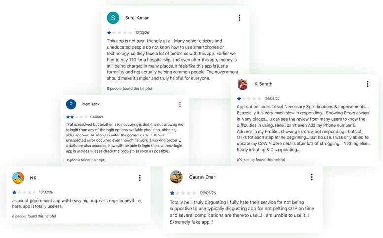
Common feedback from Play Store reviews highlighted:
- ▸confusing onboarding experience
- ▸OTP verification frustration
- ▸overwhelming information-heavy screens
- ▸readability and accessibility concerns
- ▸difficult healthcare navigation
UX Audit Findings
Cognitive Overload
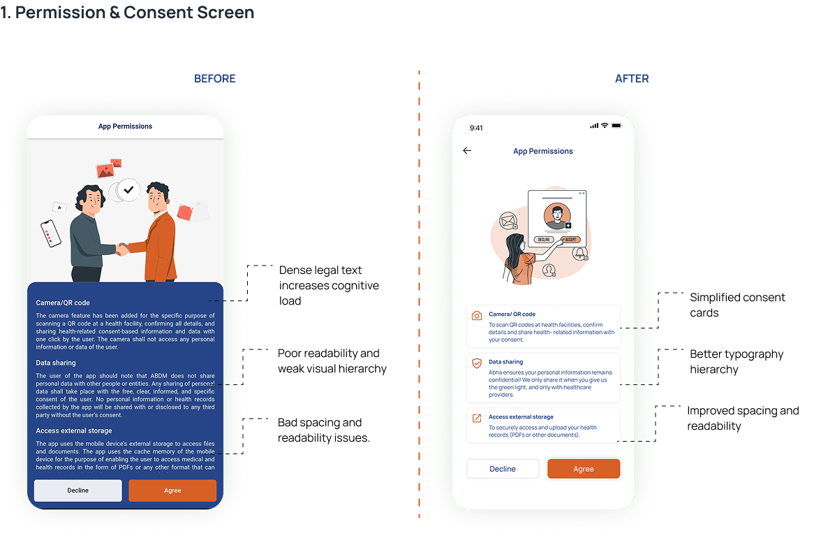
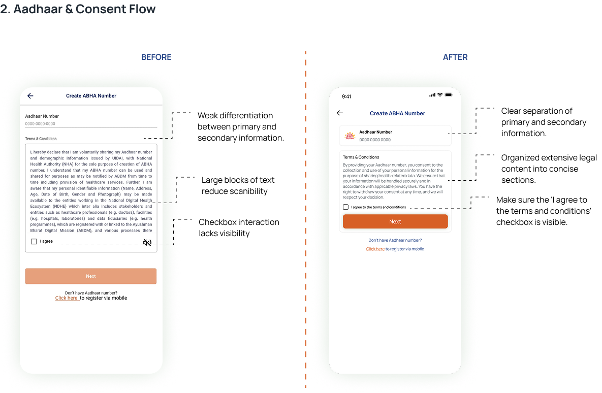
- Large legal-style text blocks made onboarding difficult to scan and understand.
Weak Information Hierarchy
- Important actions lacked visual priority, making navigation confusing.
Accessibility Challenges
- Small typography, dense layouts, and inconsistent spacing reduced readability.
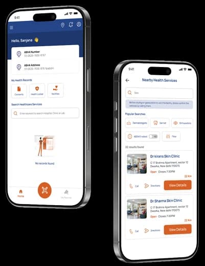
Fragmented Dashboard Experience
- The home screen focused more on identity information than meaningful healthcare actions.
Trust & Clarity Issues
- Healthcare onboarding felt bureaucratic instead of reassuring and human-centered.
Screen Audit & Heuristic Evaluation
Redesign Goal
- Reduce cognitive load during onboarding
- Improve readability and accessibility
- Simplify healthcare navigation
- Create a more task-focused dashboard
- Improve trust and clarity during verification
UX Principles Applied
- Aesthetic & Minimalist Design
- Visibility of System Status
- Recognition Rather Than Recall
- Accessibility
- Consistency & Standards
Outcome
The redesigned experience aimed to:
- Reduce cognitive load during onboarding
- Simplify consent comprehension
- Improve dashboard task discoverability
- Reduce visual clutter through structured grouping
- Improve readability and accessibility
- Create a calmer and more trustworthy healthcare experience
Key Learning
This project helped me understand how accessibility, trust, and information hierarchy play a critical role in healthcare product design.
I learned that healthcare UX is not only about usability — it is also about helping users feel confident while managing sensitive information.